3 Reasons Why Colors & Patterns Are Essential to Beautiful Interiors
Colors and patterns can absolutely transform your home physically, emotionally, and aesthetically. I am sharing 3 reasons to incorporate color and pattern in your home.
1. Color Choice Creates a Vibrant Home
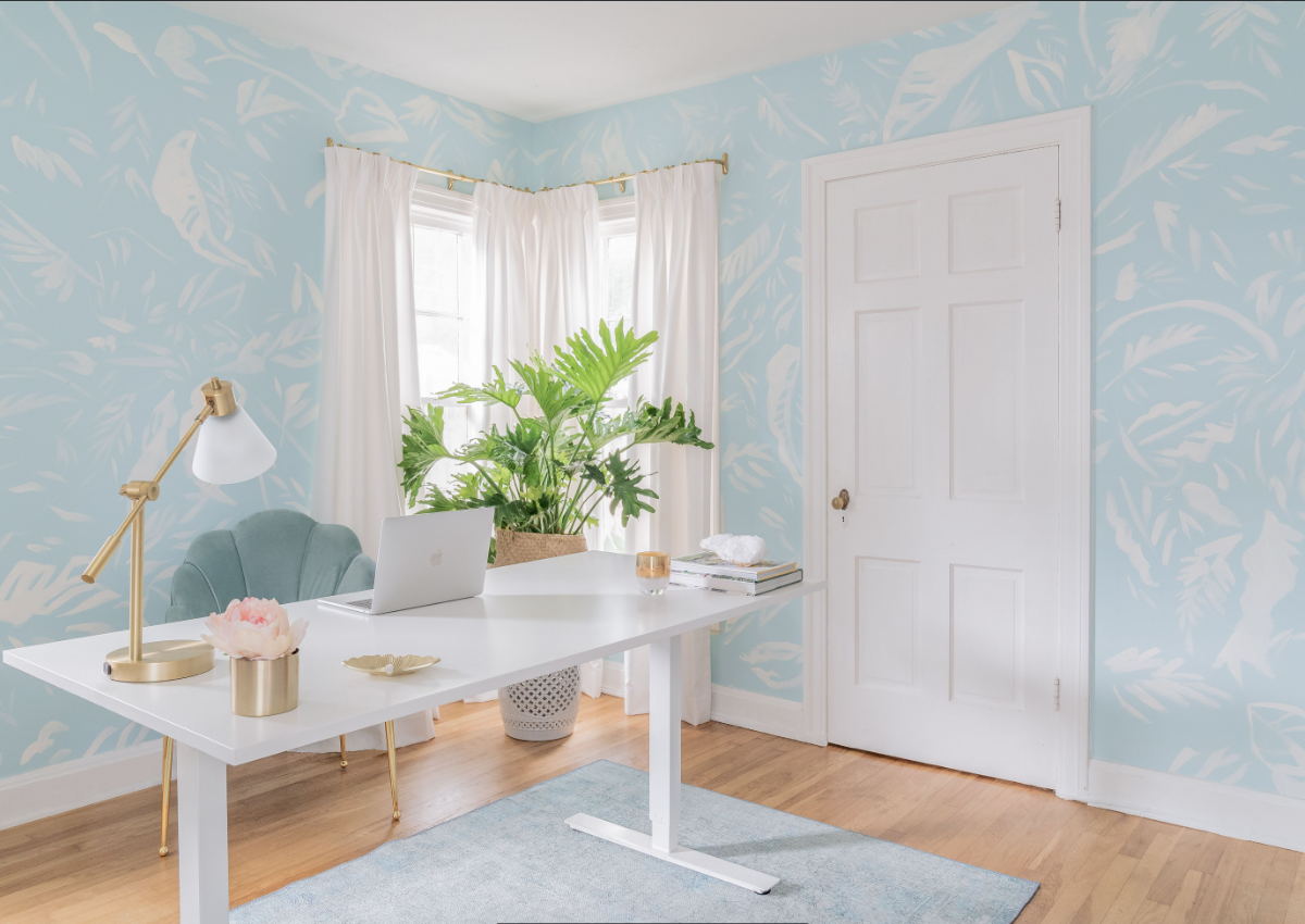
Color creates the mood of a space. Let’s talk about a home office, for example. If you want your home office to evoke a bright, calming, zen space, I recommend blues, crisp whites, and other earth tones.
Or do you want your home office to evoke feelings of power and energy - then I recommend energy colors such as reds and jewel tones. Colors evoke memories of the past and have strong emotional associations for individuals.
2. Plentiful Patterns Transform Your Space

Patterns can also transform a space. The scale and movement of the pattern when your eyes scan the room adds visual interest and personality.
For example, let’s talk about a powder room, which is often a jewel box of a room that clients want to showcase personality. Does a powder room with wild monkeys eating fruit showcase your fun and witty personality? Or does a powder room of an abstract watercolor pattern of ocean waves showcase your sophisticated vibe? Both are wonderful in their unique way!
3. Blending Colors & Patterns for a Harmonious Home

It is the unique combination of color and patterns together that create design harmony in the home. For example, we often do neutral solid colors for the main upholstery pieces and then pepper in larger scaled patterns and multicolored hues in the drapery, rugs, and pillows.
Throughout every project, my signature design style and strength is beautiful colors and patterns through textiles, floor coverings, wallpaper, and paint selections. However, it is up to the client's taste to inspire these selections.
If you hate bright red & yellow together because it reminds you of the McDonald's logo, you better believe you will not get bright red & yellow in the custom design created especially for you. Instead, we always create a lovely design that reflects you!
Are you looking for a team that can combine design strategy with your personal aesthetic to create harmony in your home? Reach out, and let's get acquainted!
Cheers,
Mimi